Hubway Bikes In / Bikes Out

Explore this interactive to discover the flow of Hubway Bikes around Boston on a typical week day:

[Capacity: ]
station name written here
Average Weekday Station Traffic by Hour
Map Header
Select an hour to see it on the map and the chart below:   
12am
1
2
3
4
5
6
7
8
9
10
11
noon
1pm
2
3
4
5
6
7
8
9
10
11pm
   or   
24 Hr Total

Insights back to top

Since usage patterns change as new stations are installed, this graphic focuses only on the recent busy months of August and September 2012. Also the data here is restricted to Weekdays in order to highlight the critical imbalances that Hubway must account for to keep the system working. Weekend traffic represents more casual users and a more balanced overall usage. Combining these data sets just dilutes the interesting patterns in the weekday data.

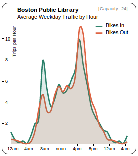
In order for the Hubway system to work, there must always be bikes and empty docks at each station when needed. One of Hubway's challenges is to redistribute bikes in the system (on a daily or even hourly basis) to keep up with imbalances in rider's usage. While some stations show a dynamic equilibrium of departures and arrivals throughout the course of the day, popular commuting stations experience high net losses or gains in the morning and evening. We visualized traffic for each station and hour of the day and analyzed how different user groups contributed to this.

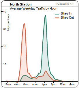
North Station (TD Garden) shows large commuter traffic

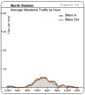
These figures highlight the dramatic usage of the North Station Hubway Station, as well as illustrating the difference between weekend and weekday usage which is apparent at most stations.

There are large numbers of commuters arriving at North Station and departing via Hubway Bikes in the mornings and returning in the evening Mon-Fri. Between 7am and 9am on a typical weekday 75 bikes depart from North Station. This station's capacity is 47 bikes. Hubway re-supplies bikes at active stations like this one to keep the system working during peak times. The evening is even more dramatic, with on average of net 88 bikes arriving at North Station over a 5 hr window.

The weekend picture is much different. Although still a popular station, no where near the same amount of traffic is coming through. Also the commuter bands are missing from the data and instead we see the more distributed usage.
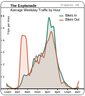
Esplanade highlights trend of afternoon Casual users

The Esplanade station shows clear commuter band in the morning, but a much more even distribution in the evening when more tourists and casual users are about.

Do Hills Matter?

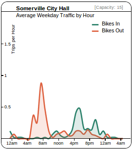
Boston is a fairly flat city and while we didn't look much at elevation data, one station did stand out. As a percentage of total trips Somerville City Hall looses more bikes than any other station (an imbalance of 10% over the whole data set). This seems striking, because Somerville City Hall is at the top of a hill. Looking at the data we see there is still very little traffic at this station, but it seems on average one person is leaving every morning who doesn't return via Hubway. Are you that person that only likes to ride downhill?

This station has only 15 docks, so Hubway has to refill the station regularly if infrequently.


How to use these charts back to top

The three charts above present some complex data in an interactive way. Here is some explanation in addition to the various legends:

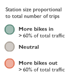
Map Each circle is centered on a Hubway station. Mouse over the circle to see that station's details shown to the left as a line chart, or click on a station to lock its data in to the line chart. The area of the circle is the average number of bikes checked out from that station plus the number of bikes checked in to that station for the current hour selected. It is meant to represent the overall traffic. The color represents whether the net accumulation is greater than 10% of the total transactions, just to give a sense as to whether this station is a starting point or ending point for more rides.
Bar chart The bar chart across the bottom has the net accumulation of bikes at a station over the selected hour, sorted by the stations that gains the most bikes down to those stations that lose the most bikes. Mouse over a station to see its data shown in the upper left as a line chart, or click the station to lock its data in the line chart. This chart is scaled, so be sure to check the axis to see whether the total number of bikes in or out is large.
Line chart The line chart in the upper left shows the data for the selected or highlighted station throughout the course of a full day. The data spans more than one day so that it is easy to see 24 hour patterns. One thing to look for is whether the station seems to be used by commuters (two sharp peaks) versus casual users (one more-gradual peak)

Credits

Created by Kim Ducharme, Kenn Knowles, Zia Sobhani and Verena Tiefenbeck for the 2012 Hubway Data Challenge.